
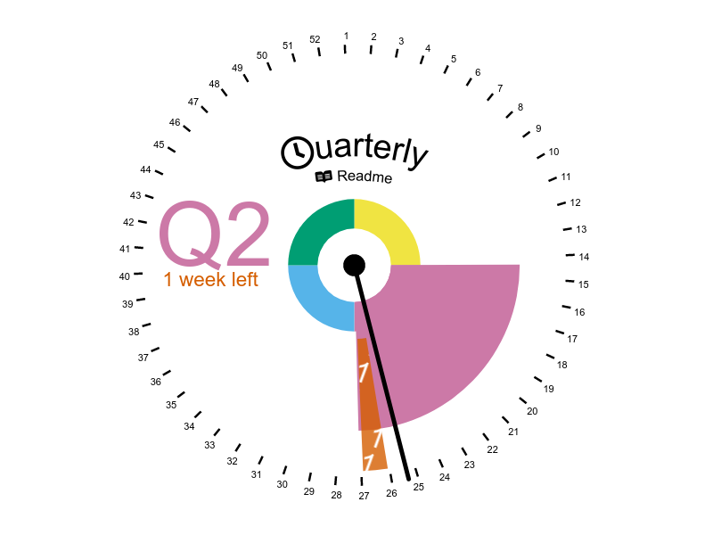
"What Quarter is it?", and "How long do we have left?", visualised as a clock.
The original idea for this came from Brett Bunting back in August 2021. Further development and feedback came from the 🚀 Hyperdrive team at Skyscanner, Stuart Paton in particular.
To some extent, I ignored Brett's subsequent wishes, so I shall give him credit for all the positives, and I'll take any negatives 😊.
The original version was as quick a hack as possible, as it was written within a lunchtime break. It used a simple HTML Canvas for rendering, and made a bunch of assumptions. For example, that one quarter == 13 weeks.
The next version was a rewrite in SVG and D3, so that various visual aspects could be tightly controlled. From there a proper date library was added, a model/view separation enforced, and some tests of the model written. The (real) subtle-but-jarring difference between weeks and quarters was directly shown. This was tweaked quite a few times to make some aspects clearer. A logo was added, via embedded FontAwesome icons.
To allow Facebook/Twitter/Slack previews of this client-side app, the strategy from "When backend is frontend, and back again" was applied.
This time, it was a Rust service running on fly.io which uses an embedded Chrome instance to take a screenshot of the main site and return it as an image. This is proxied through Netlify config so that it appears as preview.png.